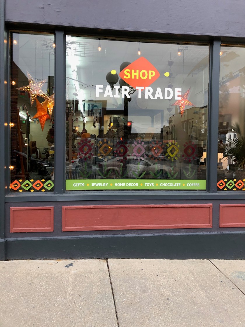
This fair trade store’s window has no backdrop so that the customer can see into the store. What I enjoy about this window is the bottom border that creates repetition and draws your eye side to side. Another way repetition is utilized in this window is through the painted flowers on the glass in a similar geometric pattern. The colors are lively and draw your attention, even from across the street. There are three mannequins in the “your values window”, two of which are the same. I like that the “odd man(nequin) out” is sandwiched between the two. It is nice that they are displaying bold, colorful merchandise, and that they are angled toward the center. Three is just a pleasing number in general. The signage is very large in proportion to the items being displayed and the star lights (lighting) is interring. There also seems to be lighting all around the window, which creates a nice ambiance and repetition. 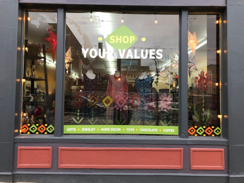
2 FruGALS Thrift – Downtown Bloomington
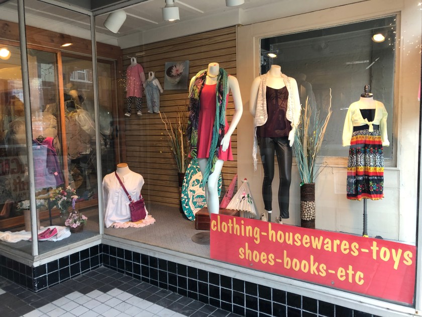
This is not the easiest layout to work with but this window is kind of fun! I like the sort of beach vibe with the turquoise colors of the fake flowers and skim-board next to the light Chinese parasols (umbrellas). I can see this store has good signage, with the sign being large in proportion so that one may see t from across the street and the lighting (string lights) above to make it more visible at night. Although it is not the most professional display I have ever seen, I do like that I can see the variety of goods for sale in this store. Right away, I am made aware that it is a secondhand store and there is even signage that tells the customer what is sold (clothing, housewares, toys, shoes, books, etc). There is a range from. baby clothes to children’s, and adult women being displayed. I see clothing as well as accessories too. There are bright colors contrasting dark faux leather leggings and varying heights to the mannequins as well. I do appreciate tat instead of placing merchandise on the floor of the display, there are some sort of doilies set down. Notice the spotlights separating three distinct sections of the display.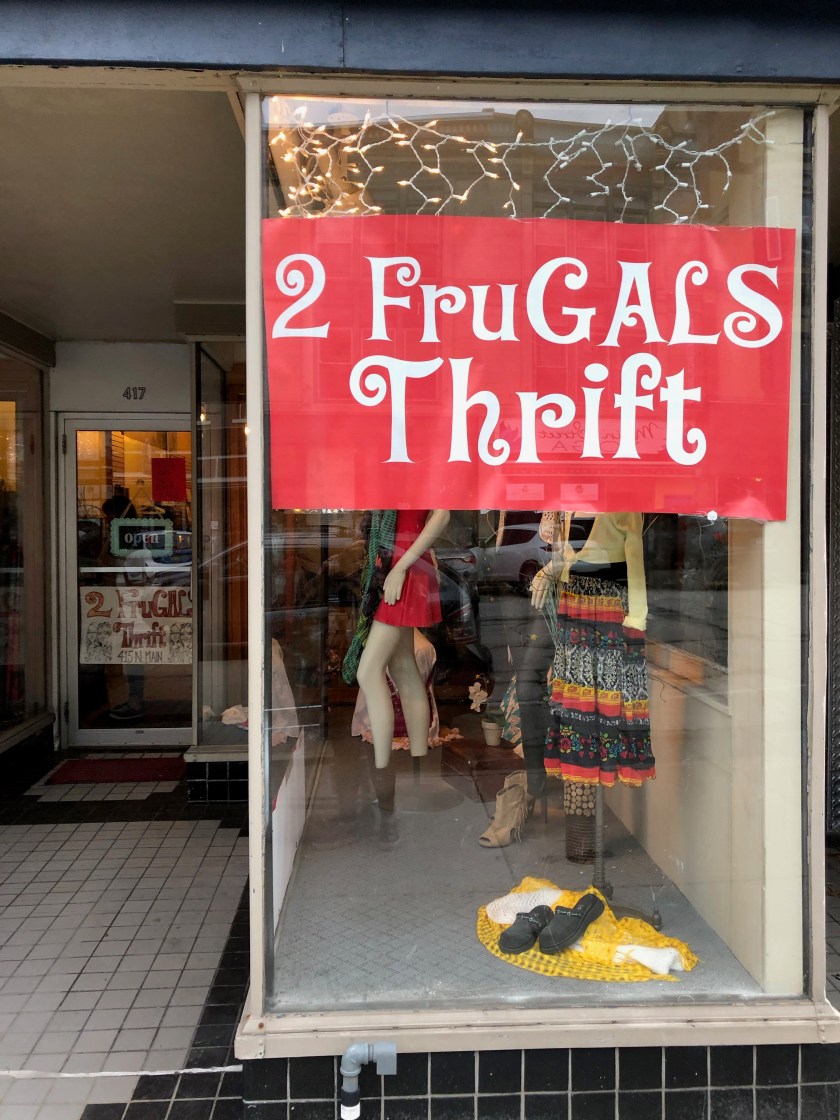
Gigi Bottega – Downtown Bloomington
Talk about eye-catching! This boutique’s window features a beautifully set table as the focal point. Because of the lifestyle aspect of this window display, I feel that it is successful. Ranging from casual to formal, there is a variety of merchandise being displayed here. I enjoy the pulled back curtain so that the visual merchandiser may choose whether we see into the store or just should focus on the window display. Having one sitting mannequin is nice because it creates a variety in the poses and allows the eye to rest. The tablecloth’s bold black and white stripes draw your eye up to the mannequins and then side to side throughout the whole window. There is a nice touch of the stool and basket on the ground too to give some depth to this display. Good job!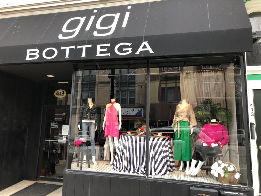
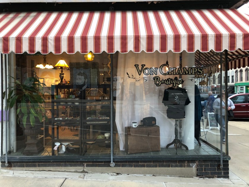
Von Champs Boutique – Downtown Bloomington
This storefront is so lovely with the huge corner window. I do enjoy the simplicity of the display. I do also appreciate the creativity of the visual merchandiser to put up the curtain behind the display so that the inside of the store does not distract from the merchandise out however, the curtain is only hanging on a portion in the window so that the customer may still see inside the store! Very clever, in my opinion. Sometimes we are not given the greatest circumstances (like the small windows in Burpo’s Boutique), but you must make the best of it (like they did by creating a makeshift divide with the curtain here). I can see that the lighting inside the store was not to the visual merchandisers liking, so they creatively hung umbrellas upside. This is a good use of proportion because it looks like a giant light fixture and attracts your attention. I enjoy the varied heights of the display, one side including a mannequin and a chair, and the other side showing off a mannequin wearing a funny t-shirt and vintage trunk. Note the vintage-look hanging lighting on this part of the display too. The part of the front window, with the background of the exposed store with the table and large tote bag are a good use of proportion. Overall, this looks simple yet plentiful and I would go in to this store.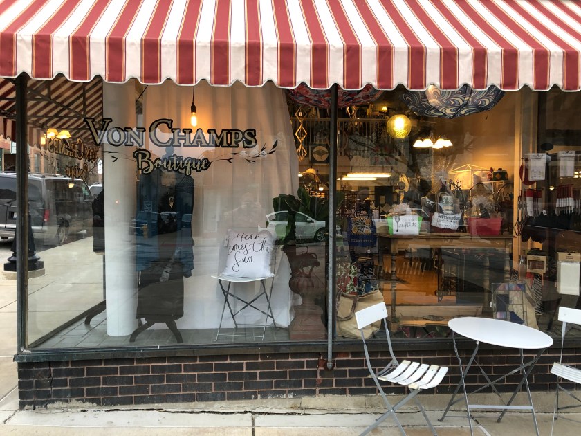
Burpo’s Boutique – Downtown Bloomington
Because this boutique only has small windows to work with, due to the older building it’s located in, there is a lot of merchandise crammed into the display. It seems as though only tops and accessories are being displayed, so I wonder if that is the only merchandise available for sale or if this is due to the lack of space in the window. With all of the different types of mannequins and necklace stands in the display, I kind of wonder if this is a secondhand store. Something the visual merchandiser, if there was one, could have done better was to display LESS and on uniform mannequins/stands. This would have made the window look more cohesive and less thrown together. I am confused on the placement of the necklace displays as they seem to be facing random directions, not necessarily on purpose. It also bothers me that the jewelry being displayed is on one level, as I feel there would be more visual interest if the items were at varying heights. Overall, this window is not successful because it does not make me want to go in the store. If the inside of the store is anything like the window, it is cluttered, random. Another thing I would like to point out is the way the lighting is hitting the tops in the display. First of all, the lighting is much too yellow and makes the clothing look discolored. Secondly, It should be on the jewelry as well instead of pointing awkwardly at the blouses hanging in the background. Because the elements/principles of design are not being applied, my eye has a hard time to travel through the window. There is also no distinct focal point to catch my attention on the street, so I would probably walk right past this store. 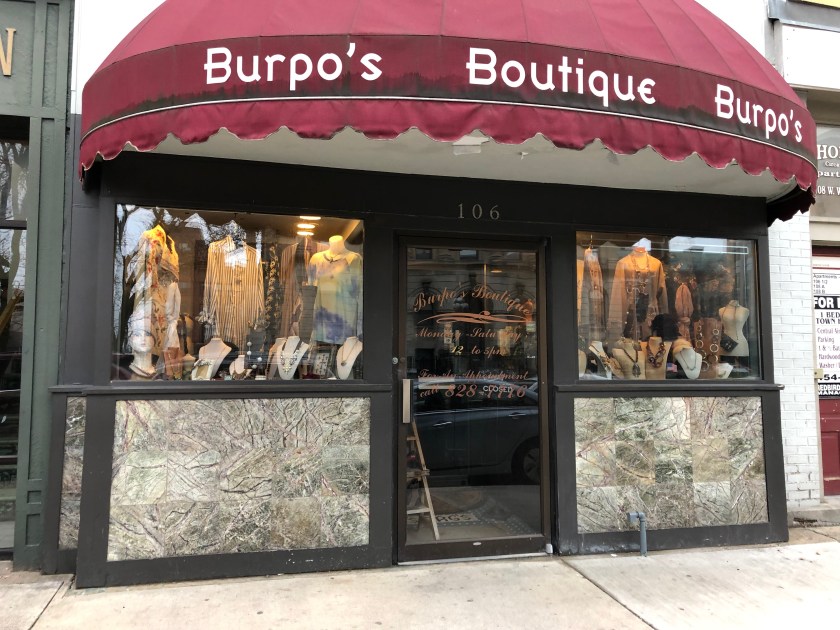
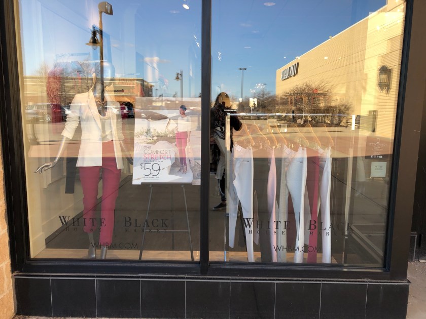
White House Black Market – Shoppes at College Hills
Because this window display has no walls or posters to separate from seeing inside the store, the visual merchandiser used this to his/her advantage. In this window, you can see the hangers of clothes and there is a rack of pants incorporated into the display as well. This makes the display seem more like a part of the store and vice versa (the store as a part of the display). Unlike the other windows of the outdoor mall, this store does not feature huge posters advertising sales. Instead, there is an easel with a small poster that in proportion to the mannequin right next to it. Because the poster is between the one mannequin and clothing rack of pants, there is a balance (quality of visual weight) in this window. On the other side of the display, the customer sees one mannequin that is on a table (taller than the other three mannequins) therefore emphasizing it. Emphasis is also placed on this mannequin because it is the only one showcasing a top without a print in the brightest color of the outfits. Similarly, the purse (in the same color) is emphasized because it is the only accessory on the table and both mannequins are turned toward it as if both looking at it. This store was successful in merchandising with this window, I wanted to go inside to see what other items were “blooming”.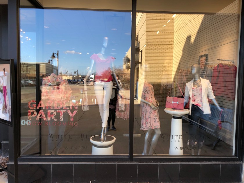
Francesca’s – Shoppes at College Hills
By alternating the striped ensembles, the display has visual interest. The vertical stripes on the clothing draw your eye up and down and create a rhythm. The display window with the shelving lets customers know that this boutique sells more than just apparel items by displaying household and gifts as well.


The Children’s Place – Shoppes at College Hills
The window at The Children’s Place is interesting to me because it does not have any merchandise. Instead, there are large posters hanging, as well as large ‘sale’ signs in the window. This is a good tactic to get people into the store. The people attracted to these signs are those who already shop at this store or are familiar with the kinds of products offered at The Children’s Place. Those who are not already brand loyal will see that one of the signs says “All Graphic Tees $4.99” and will be enticed by the low prices, hence coming in the store. Located in an outdoor mall, the proportion of the signs is smart because it is the focus in the window, even next to the images of children. A customer can even see the signage from the other side of the street! Some of the repeating shapes, 3 egg-shaped signs, hint at the upcoming holiday (Easter). The colors are bright and lively, just as the upcoming Spring season is.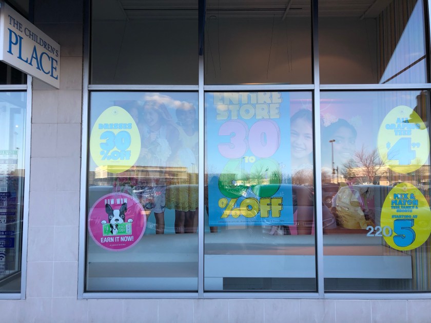
Dressbarn – Shoppes at College Hills
Proportion is the main element of design I notice in the Dressbarn windows. The size of the posters is much larger than the mannequins. This is a good way to attract customers at this outdoor mall because they will see the large images from far away and when walking next to the store, the clothing items on display will be seen. I enjoy that the mannequins are arranged in groups of three as well as being set at three different heights. This gives visual interest to an otherwise plain window.
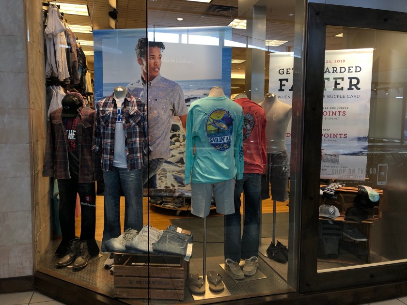
Buckle – Eastland Mall
For me, this display has room for improvement. What was an attempt for rhythm, repetition of the mannequins, comes across to me as unbalanced. When I say balance, I mean the distribution of visual weight is off in this window, it is too heavy and crowed. For the size of the window, there is too much merchandise being exhibited. There is one too many mannequins on the right-hand side. They could have done without that one, especially because it is only wearing bottoms (big no-no!). The shoes in this display look as if they are randomly thrown down on the ground next to the dress forms, they are not evenly or nicely placed in this display (almost like an afterthought). The crate with the jeans that are almost falling off in the display along with the very large poster are too much for such a small window and look disproportionate. On top of having too much in this window, there is too much going on. There are more crates to the right-hand side of the window, which are almost hidden due to the emphasis of the large hanging posters. All the way to the left, the dressform has a hat and bulky boots which not only make it look much smaller than the one right next to it, does not “go” with the shorts that the dressforms on the right are wearing with flip-flops. That one is unbalanced in comparison to the other dressforms. To me, there is a lack of harmony in this window.